


Van Dieman's Ink
Professional - Natura Dualis Harvest Tide Dual Tone
Professional - Natura Dualis Harvest Tide Dual Tone
4ml Sample
Dino-Writes Warehouse
1 Pemimpin Drive
02-06
Singapore 576151
Singapore
Choose options
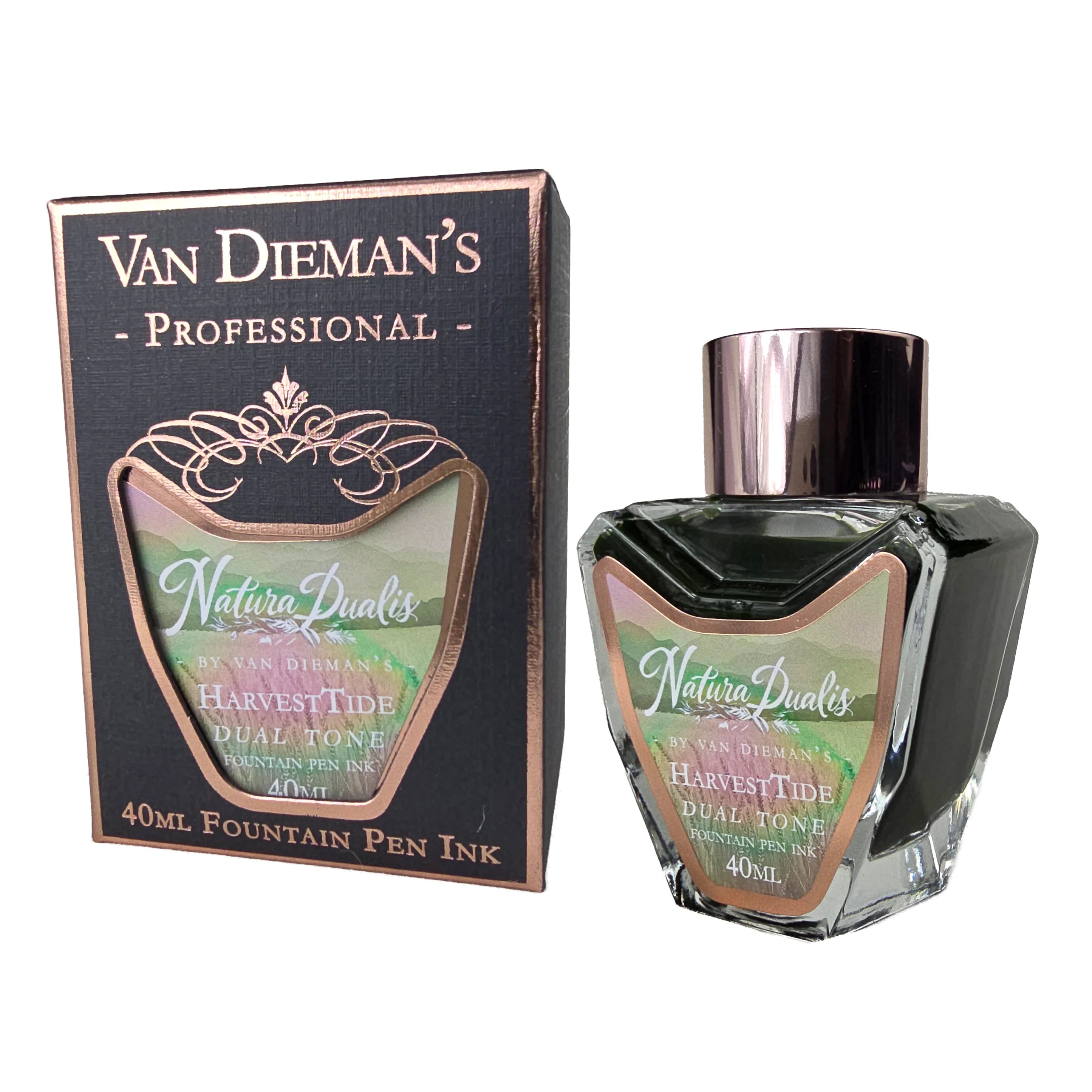
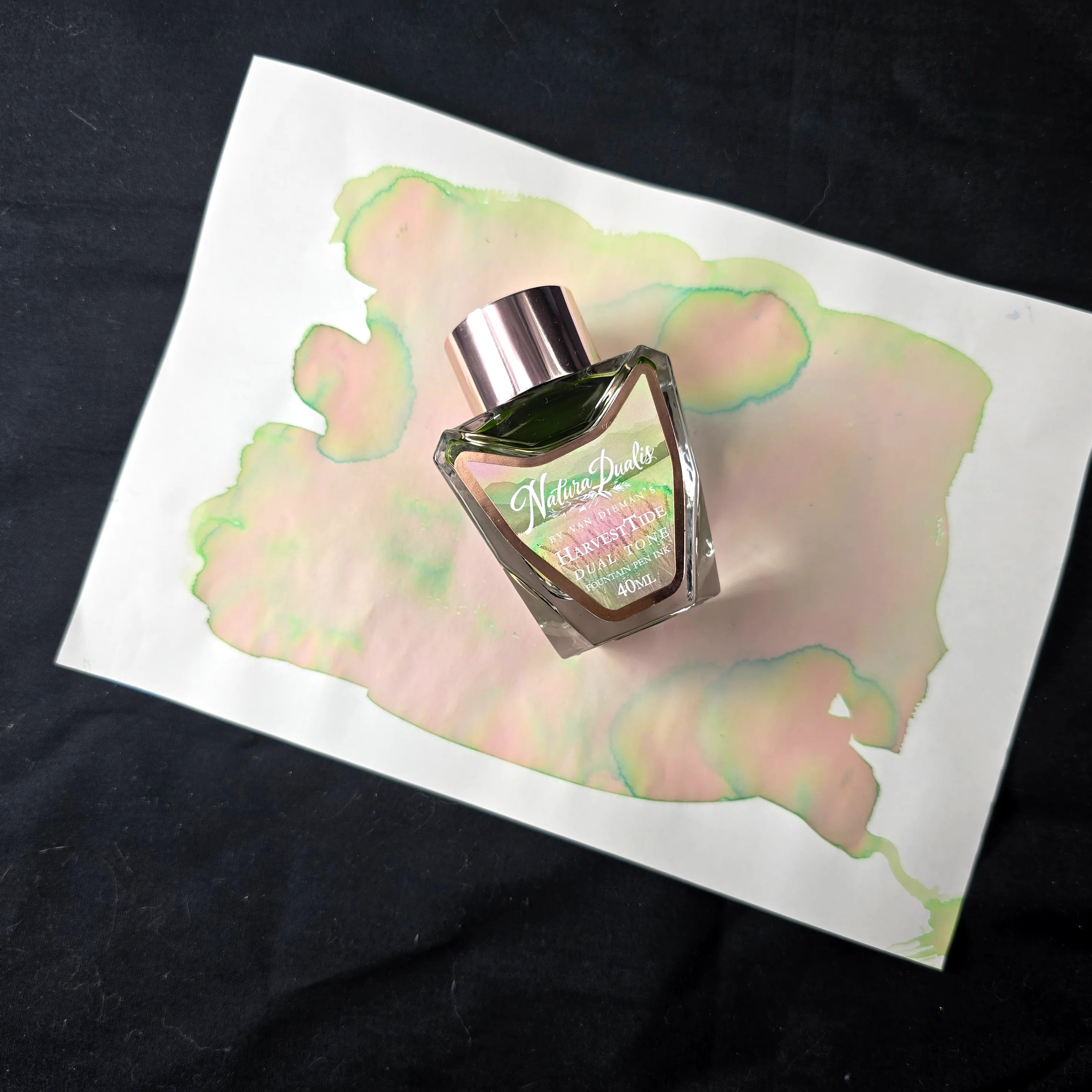
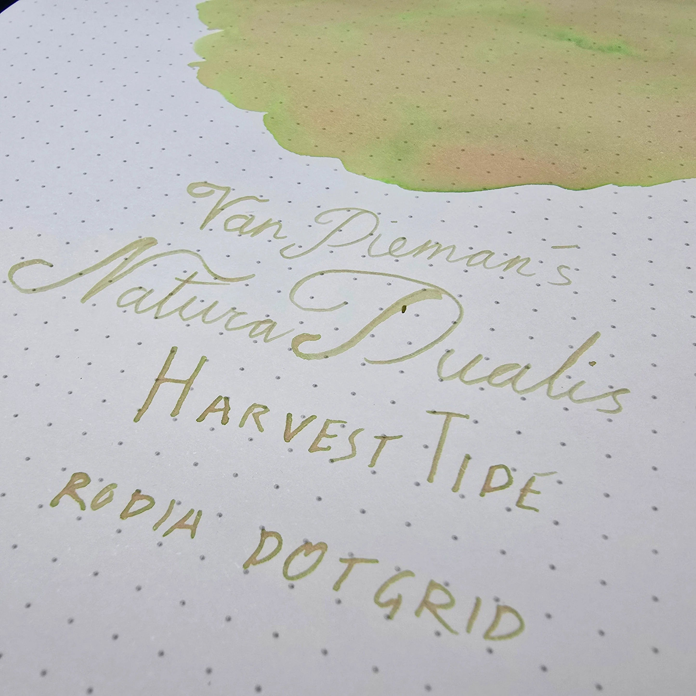
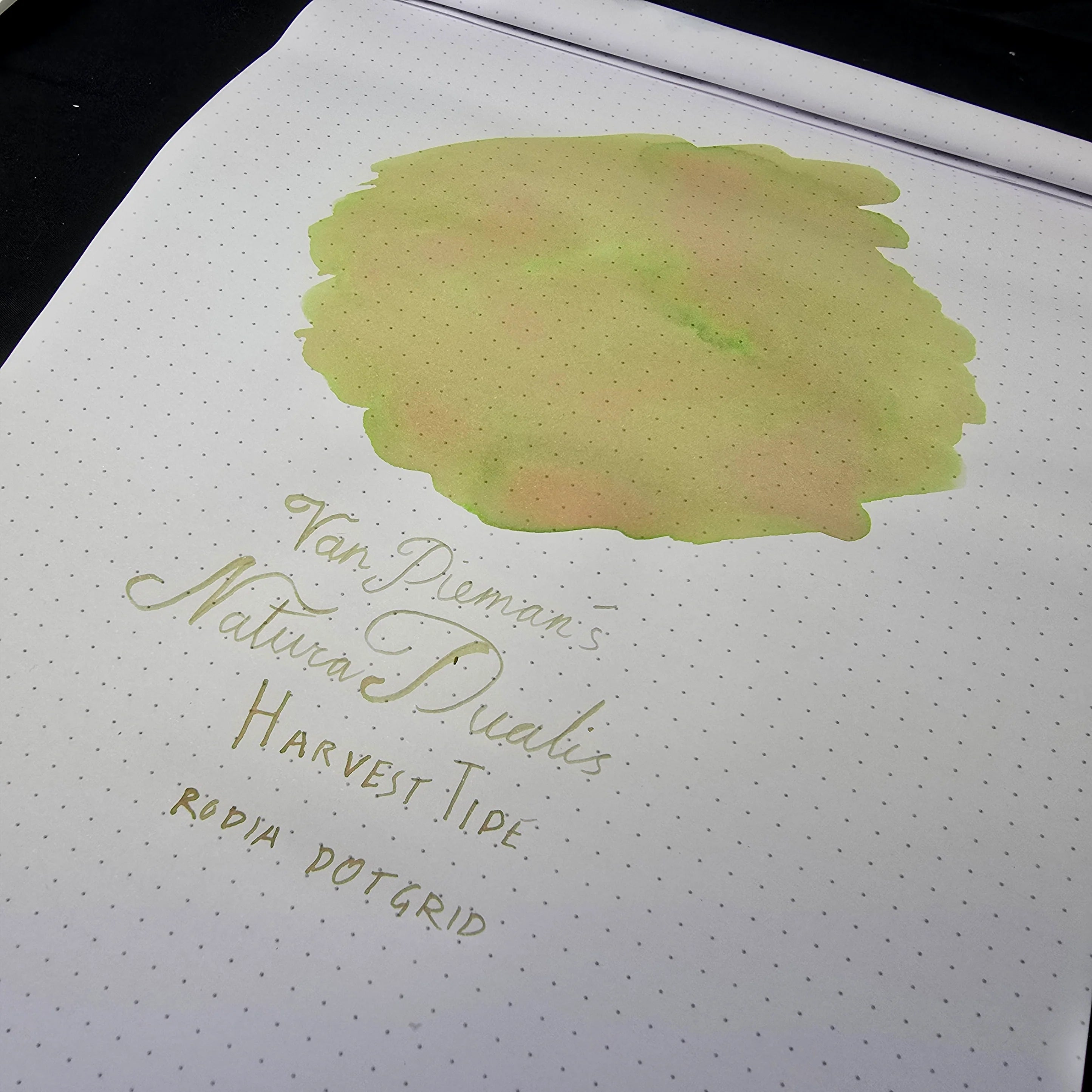
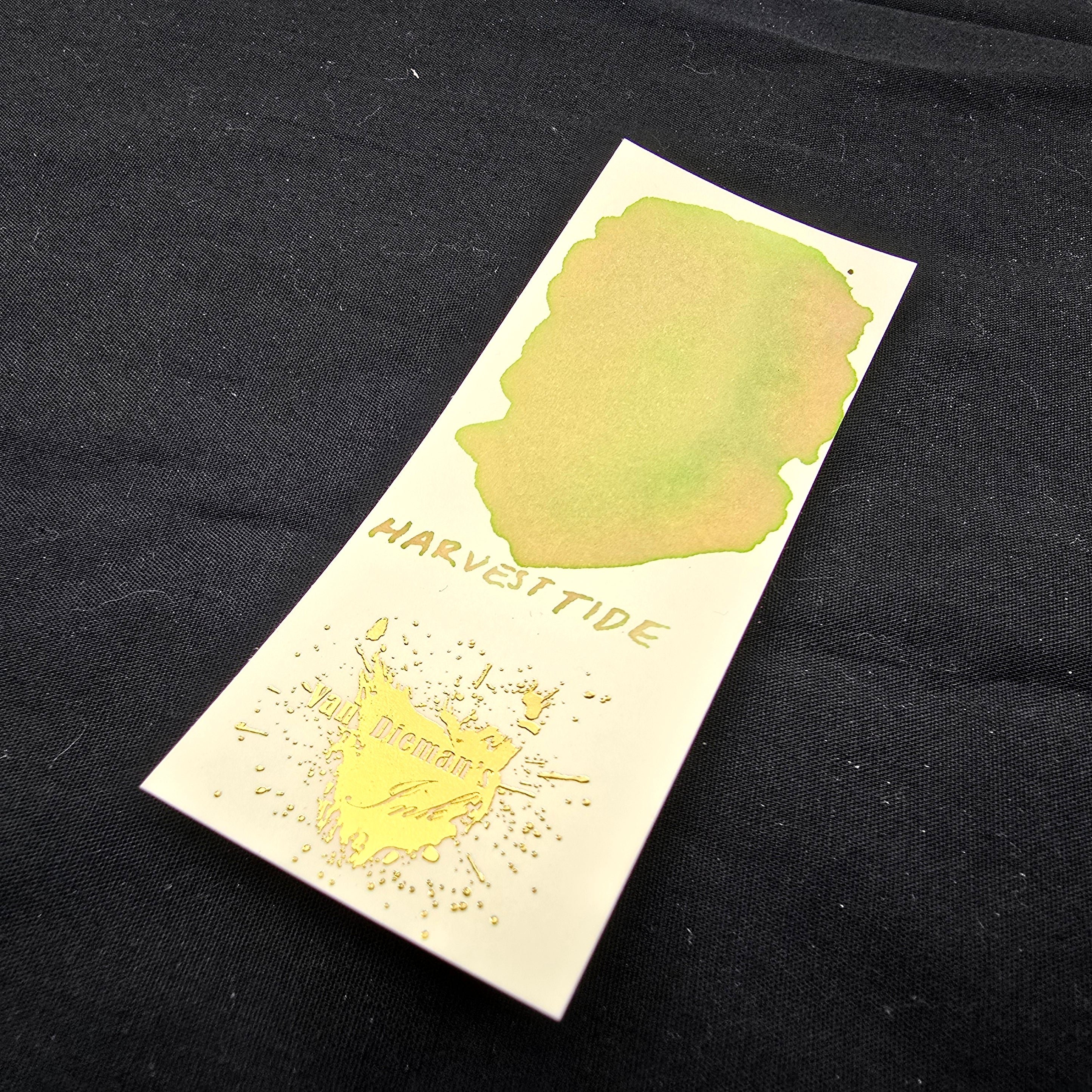
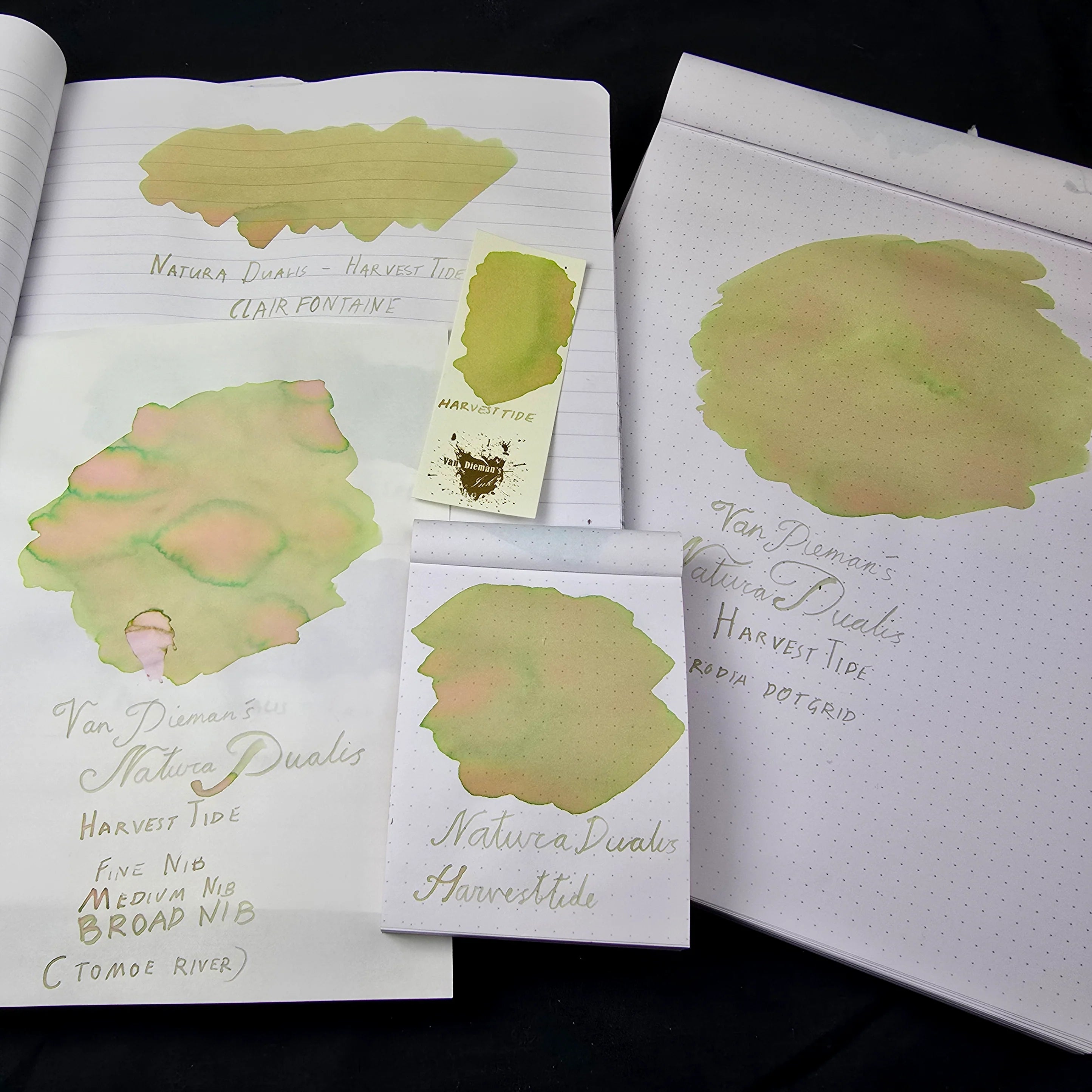
HarvestTide – Natura Dualis Collection
The Natura Dualis collection by Van Dieman’s is an exploration of contrast and harmony within the natural world — where opposites don’t collide but coexist. Each ink is designed to embody a moment of duality: night meeting day, earth meeting sky, water meeting land, motion meeting stillness. But this is more than a thematic idea — it's built into the ink itself.
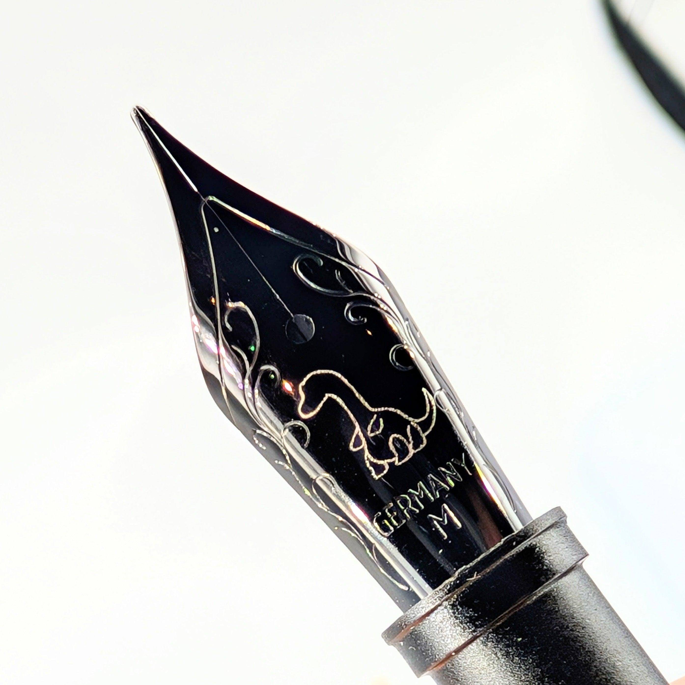
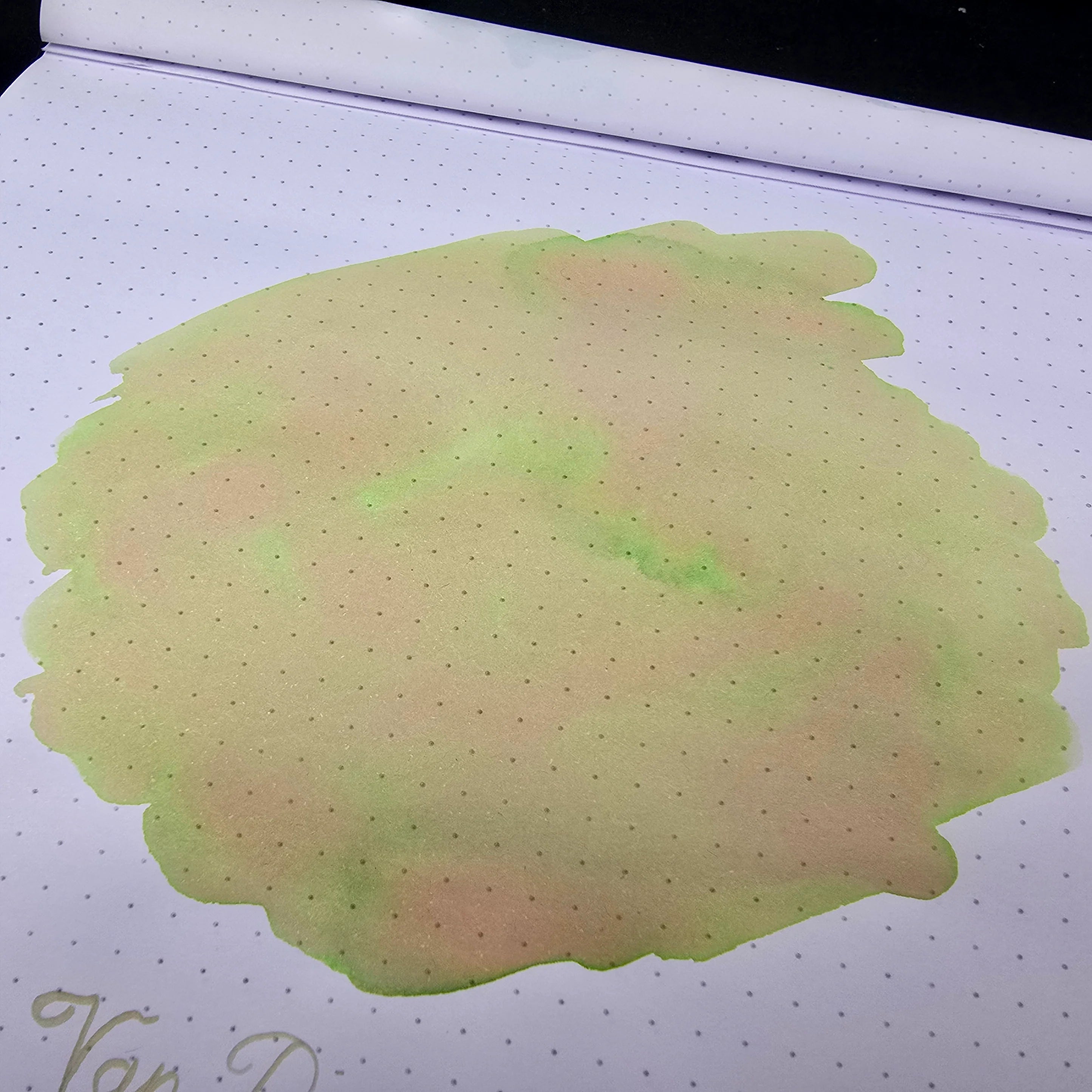
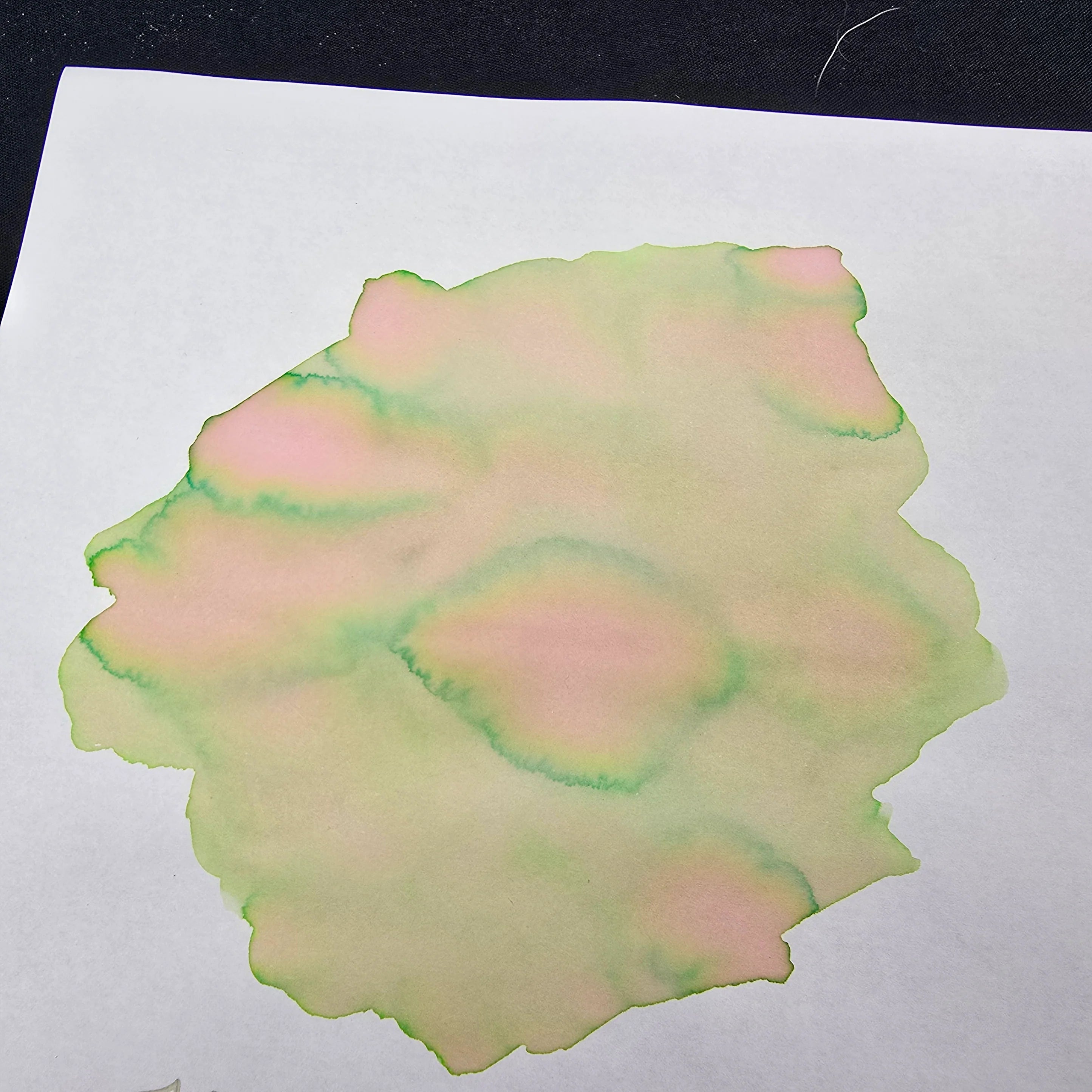
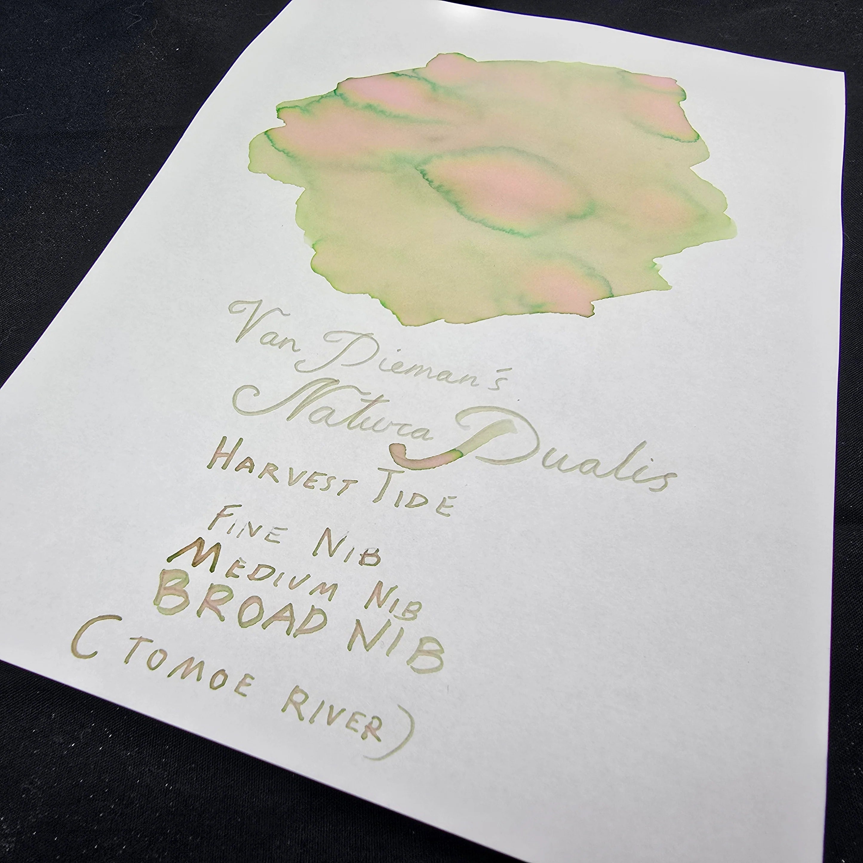
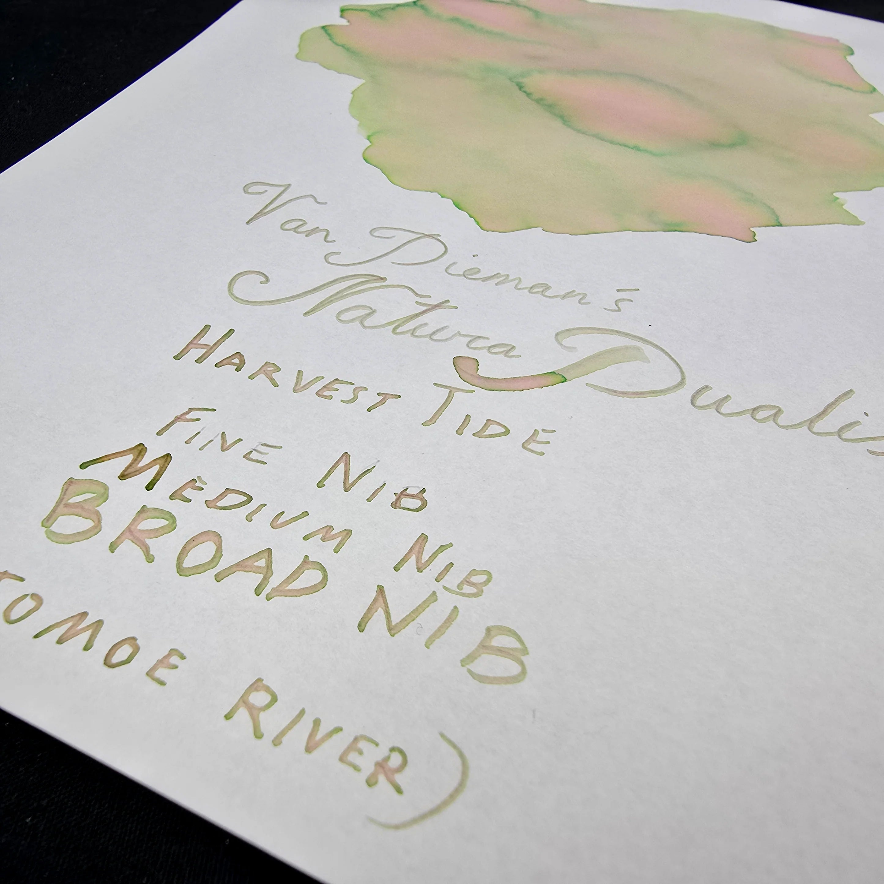
Every colour in the Natura Dualis series is formulated for dual or multi-shading performance. These inks are crafted to produce highlighted edges, riverlets of secondary tone, subtle halos, and even colour splits — revealing hidden depths as they dry, depending on the nib, paper, and flow. The result is writing that feels alive, and ink that tells more than one story.
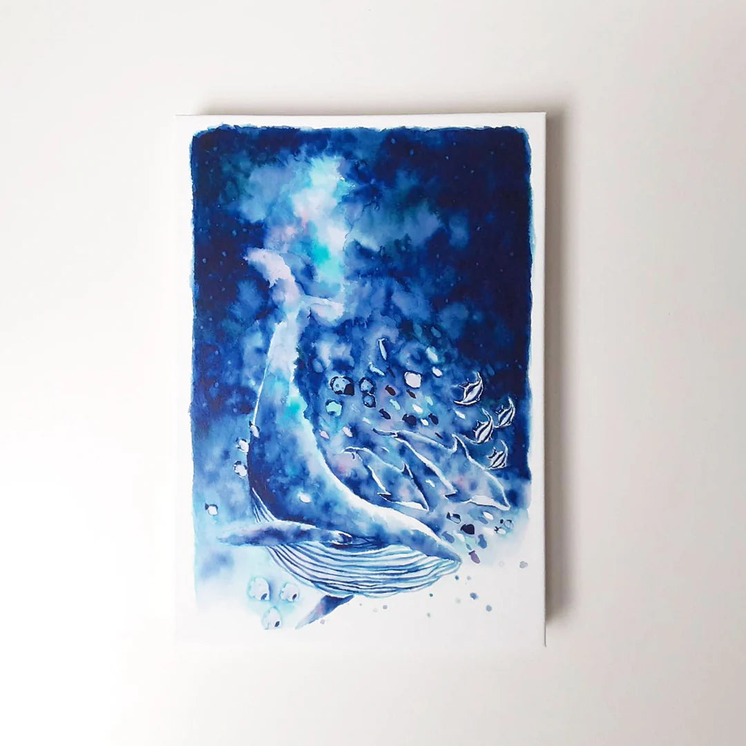
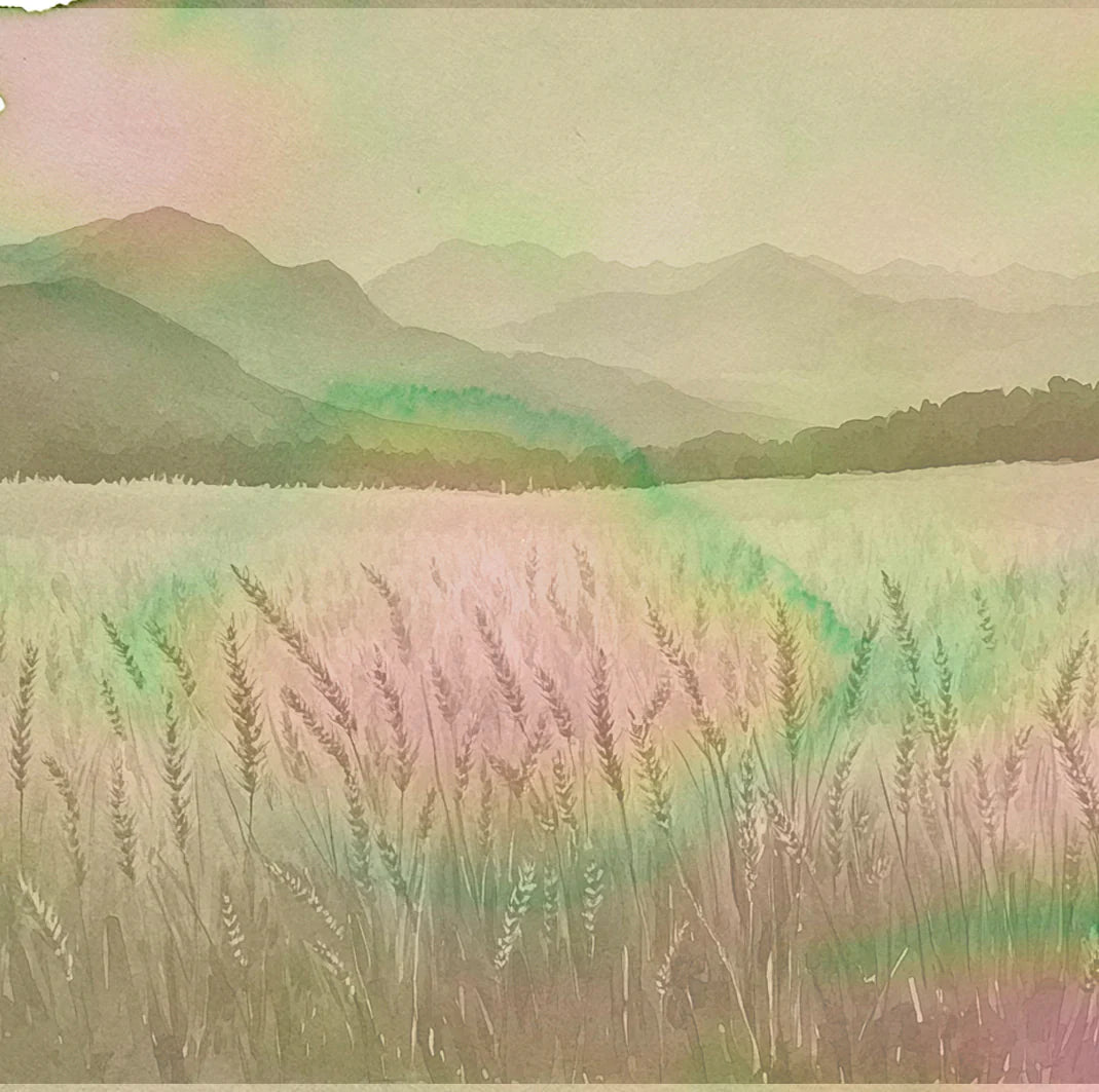
HarvestTide brings this vision down to earth. It captures the precise moment where summer begins to tip into autumn — when the wheat is tall and gold, but the light has softened and the air carries the first cool current of change. If Daybreak and Nightfall are skybound, HarvestTide is rooted in the land — in grain, soil, and seasons turning.
The colour is soft but richly complex. A mellow golden base gives way to cool green halos and hints of rosy warmth in areas of ink pooling. The shading is subtle but unmistakable — layers of warmth and coolness, ripeness and rest, all in one. On Tomoe River and other high-performing papers, expect dramatic multi-tonal flow; in regular writing, a warm, organic variation that settles into something timeless.